Personal Branding
Programs Used:
Adobe InDesign, Adobe Illustrator, Adobe Photoshop
Project Origin:
Rocky Mountain College of Art + Design Project
Purpose:
Personal brand identity.
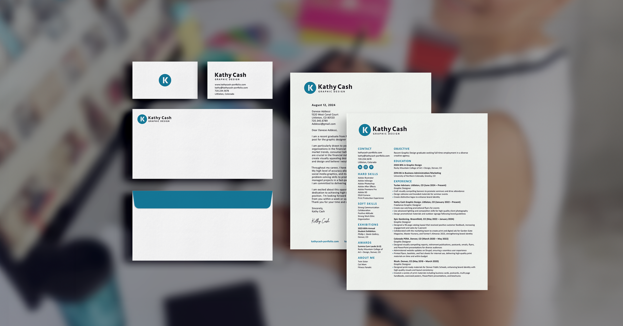
For my own personal brand, I wanted to create a modern yet simple design that is easy to remember. I enjoy designing using a geometric style and wanted that to be depicted in my branding. Originally I was thinking of using my initials in the shape of a pencil, but thought it would be more original to create a simplified design without forcing any creative elements.
Process Work
Research
I decided to incorporate a circle into the design as circles symbolize stability and unity. Additionally, I chose the color blue to represent trust and reliability. To gather some inspiration, I began researching ideas online and exploring how monograms blend elements of lettering.
Sketches
I started out researching ideas online and seeing how monograms combine different parts of lettering to help give me some inspiration. Then I started roughly sketching some loose ideas trying to connect the K and C within the lettering. After sketching out a few ideas, I tried combining and cleaning up some of the concepts.
Typography
Hind is a humanist-style font with flat stroke endings, portraying a professional, creative, and legible appearance. It also aligns with the style envisioned for my brand.
Color Palette
After researching the meaning behind different logo colors, I chose the color blue. Blue often represents reliability and professionalism, which are attributes I wanted to emphasize in my brand.
Digital Iterations
After trying out different variations, I ultimately settled on a minimalist and elegant design for my logo. The circular icon with a prominent "K" in the center best captured the aesthetic I was aiming for.
Final Logo
Logo Lockups
Environmental Contact


