JiaTea Rebrand
Company Rebrand:
Adobe InDesign, Adobe Illustrator, Adobe Photoshop
Project Origin:
Rocky Mountain College of Art + Design Project
Purpose:
Rebrand an existing company.
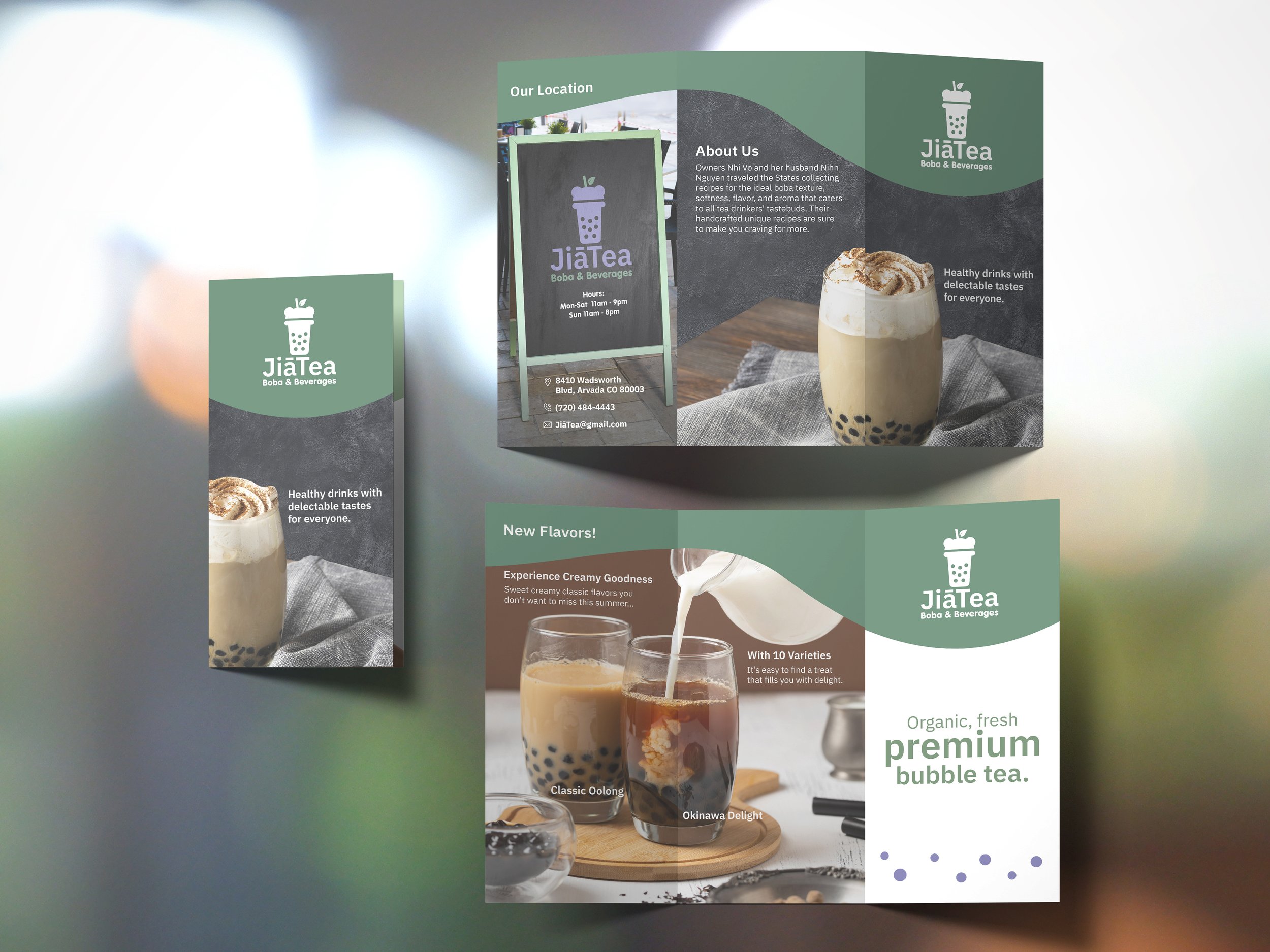
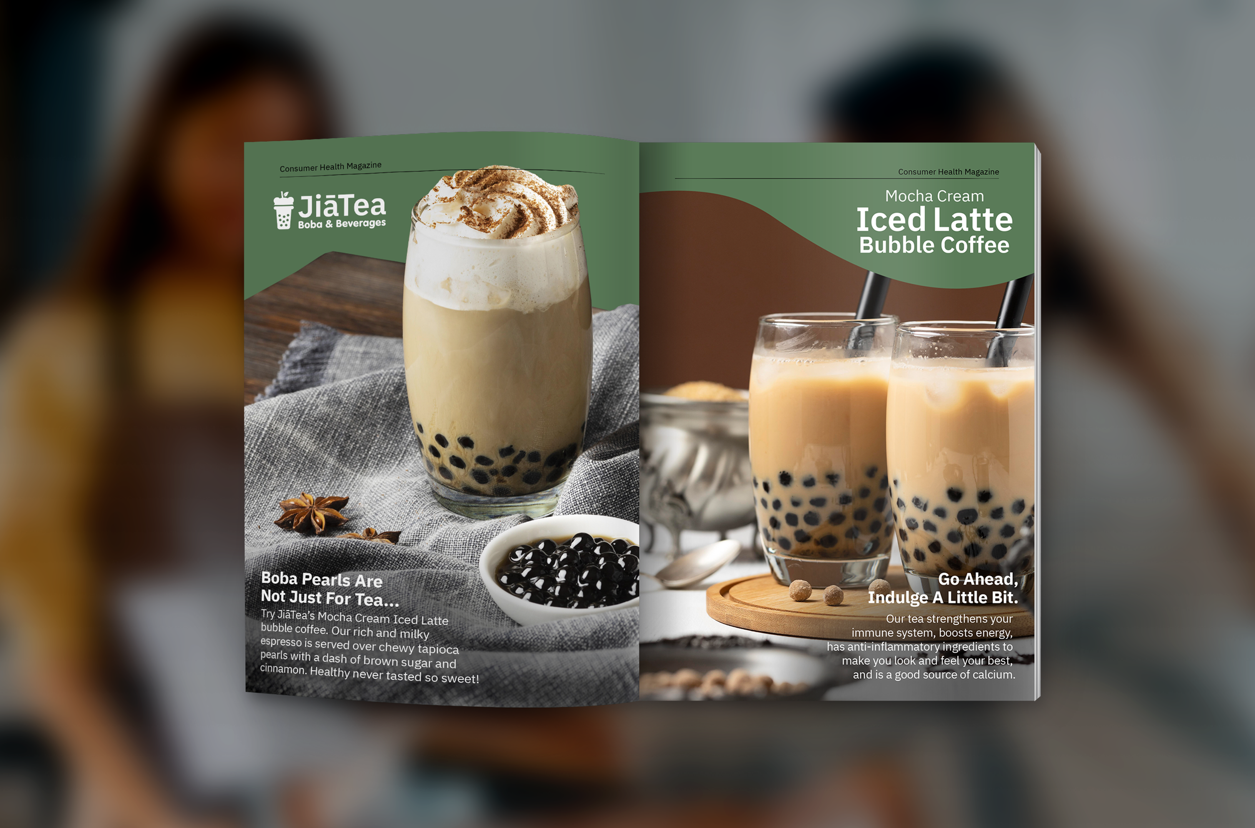
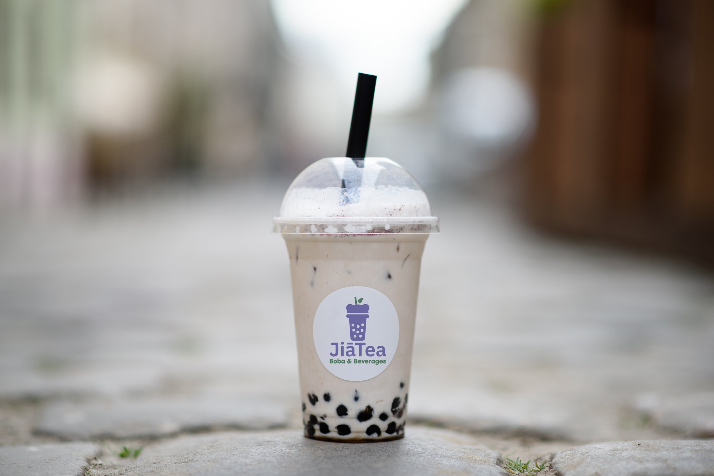
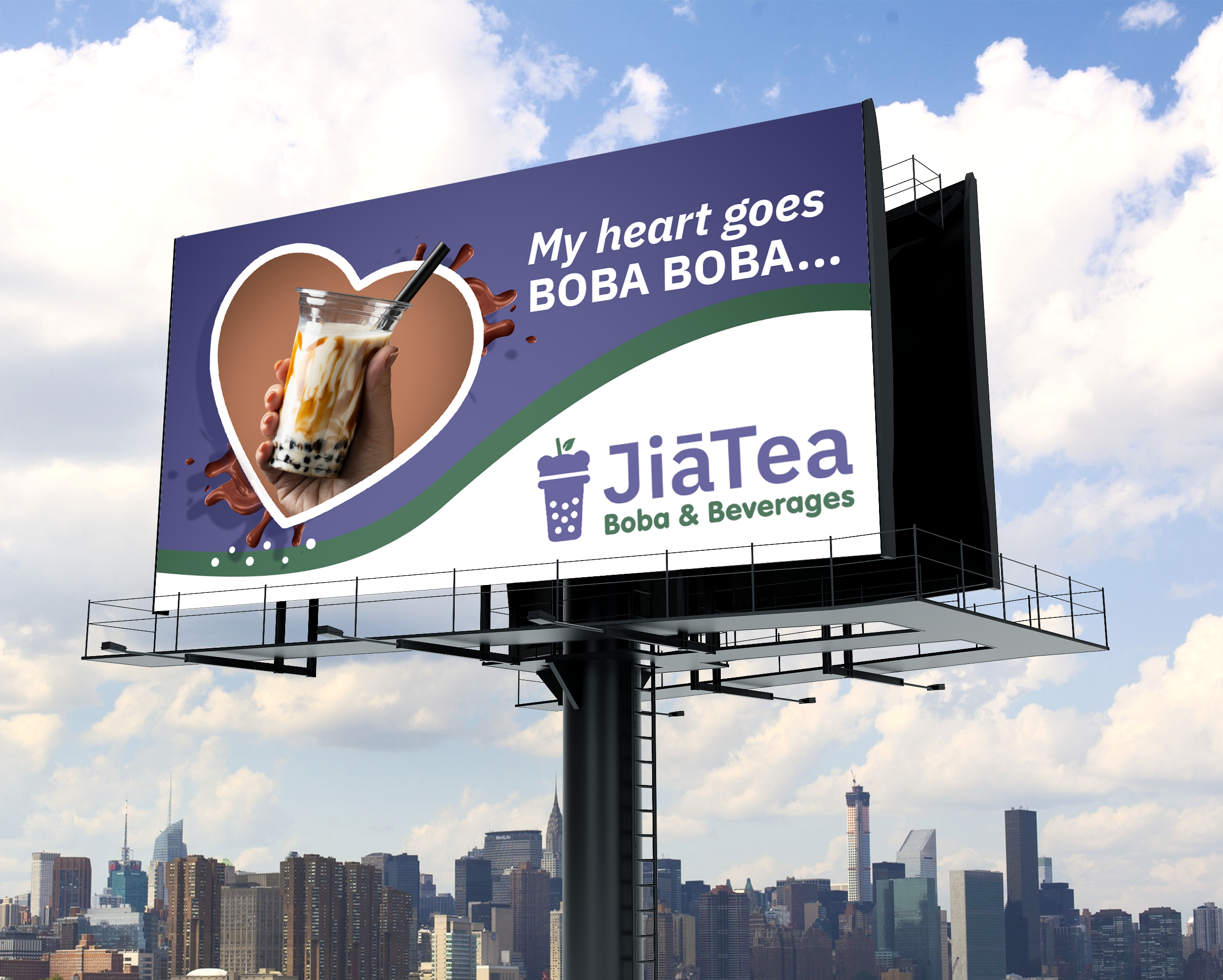
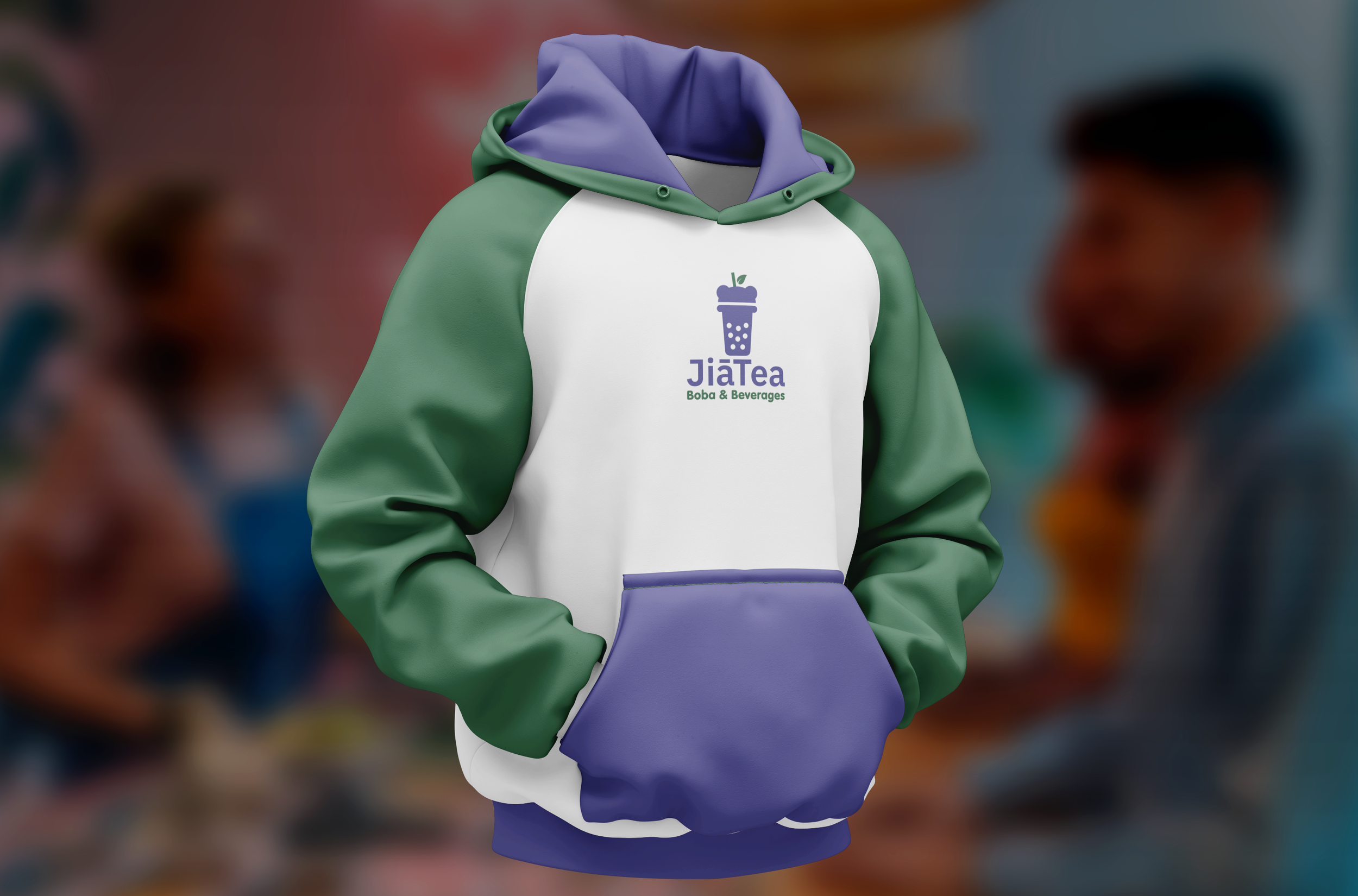
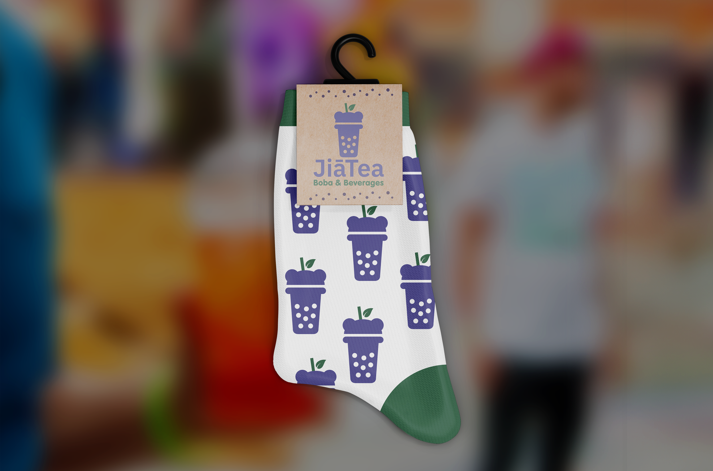
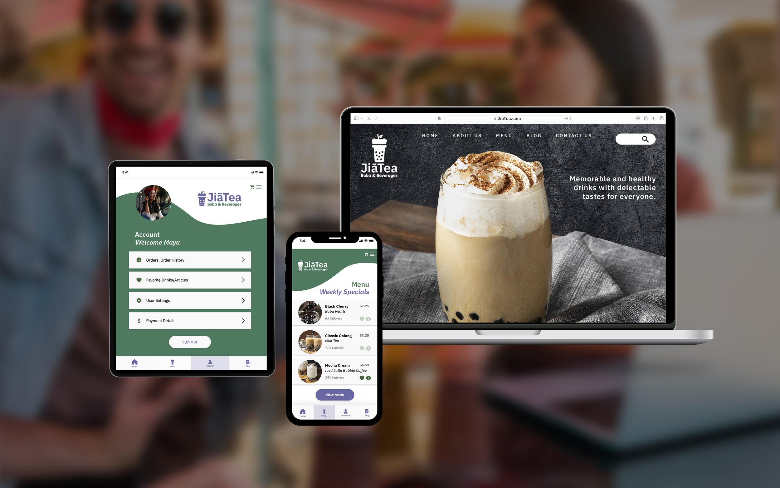
The goal of this project was to rebrand a existing company, which involved creating a new identity system, a stationary suite, and a brand book with real-world mockup examples of where the design would be found.
Original Logo
The original logo concept was designed by the company’s ten-year-old daughter. They incorporated two pandas to represent their son and daughter and chose “Wee” to emphasize “we drink tea together.”
Final Logo
The updated design maintains the original shape of the panda bear head but removes the detail within the logo. It also uses thicker lettering for better readability as drivers pass the storefront. I wanted to remove the text “Wee” because I felt like it could have a negative connotation for a beverage company.
Process Work
Research
WeeTea was established in 2021 in Arvada, CO. The company specializes in selling boba tea, beverages, and snacks, focusing on organic, healthy ingredients, with an emphasis on community and beverages suitable for everyone. To maintain the company’s focus on community, the company will be renamed JiāTea (Jiā means family in Asian culture). To cater to the target audience of people who are ages 18–30 years old, the brand will receive a new company name, a simplified yet modern logo, an updated color palette, and a more readable typeface.
Sketches
When creating sketches, I experimented with incorporating a panda because it was part of the original logo. I also tried out different variations of beverage cups and illusions within the letters.
Typography
The original typography used was a sans-serif font that was thin and difficult to read at a distance. For the new font, I emphasized a more readable font, with a simplified yet fun and modern feel that appealed to the younger target audience.
Color Palette
I chose purple because, in Asian culture, the color purple represents community and togetherness, which aligns with the company’s goals of bringing people together. I chose the color green to emphasize the organic, healthy ingredients that the company uses in their beverages.
Graphical Elements
I wanted to incorporate an organic-looking green shape to appeal to the healthy, organic drinks offered. The purple bubbles represent boba bubbles found in the drinks, and the outline of the logo would be utilized on the package design.
Digital Iterations
Here are the first iterations of my digital designs. I experimented with different cup styles, pandas, and new company names.
Final Logo
The updated design maintains the original shape of the panda bear head but removes the detail within the logo. It also uses thicker lettering for better readability as drivers pass the storefront.
Logo Lockups
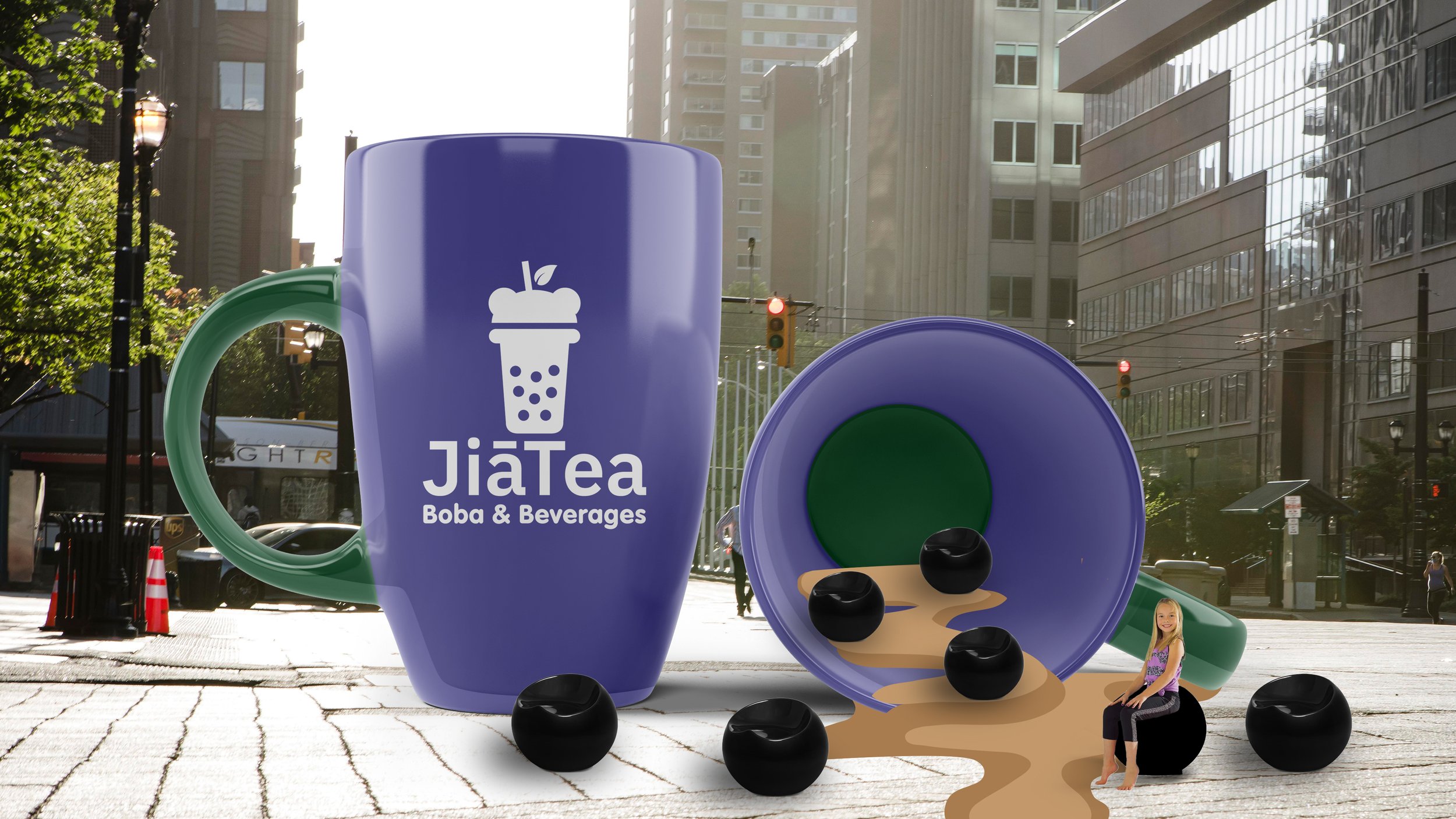
Environmental Contact
